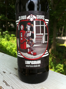
Presenting my latest label for Clown Shoes Beer, Lubrication American Black Ale. The launch party is tonight at Foundry on Elm in Davis Square, Somerville. Foundry is new to the area, I’m not sure when it opened, but it feels like it’s been in the Square for years. It is classic and comfortable, with elegant seating and lighting, and a slight edge that lets you know that the food will be approached with an artistic eye and creative twists. Also, they serve poutine! So, yeah, you know I’m giving Foundry the thumbs up.
Now, back to the label. This is only phase one of the Lubrication package design, as Lubrication will be the first Clown Shoes beer available in 12 oz. bottles. The smaller bottles will come in a 4-pack carrier and in cases.
The 12 oz. label presented a new challenge. Because all of the previous Clown Shoes beers were only released as 22 oz. bombers, the labels had a lot of real estate and that allowed me to develop a direction that was very illustration-centric. The 12 oz. bottle labels are considerably smaller, but require a lot of the same information, legally speaking. Featuring a prominent illustration would not be practical, yet, the illustrations are part of the brand we’ve established for Clown Shoes.
To further complicate matters, Clown Shoes is planning on releasing the Clementine White Ale to a 12 oz. bottle, too. The Clementine label was illustrated and designed over a year ago, when they only released 22 oz. bottles. Whatever solution I developed for Lubrication would have to be retro-fitted to work with Clementine and any other previously released Clown Shoes bombers.
The solution was to design a “shoe-centric” text only label for the 12 oz bottles that would incorporate a single identifying mark of the 22 oz. label, for the Lubrication it’s the white, horizontal “grill lines,” for the Clementine, the swirling unpeeled oranges. Then, on the 4 pack carrier, the illustrations will be expanded beyond the small windows on the 22 oz. bomber labels to fill one full panel of the box. This kept our illustration-based branding visible on the cooler shelf, but gave us a simplified, scalable solution for the 12 oz. labels and by extension, the case box design which could only be 2 colors.
I can’t wait to post photos of Phase 2, the 12 oz. bottles, the 4 pack carriers and the case boxes. We’re also getting custom crowns, bottle caps to you and me. They’re on a ship in the Atlantic at the moment, but they’ll be here in a few weeks. In the meantime, I’m going to crack open this bottle of Lubrication and pour myself a tall, dark and handsome pint of ale.