It’s been radio-silence from me since last week, and I apologize. I’ve been running about handling off-line responsibilities and there has been little time to blog. But I’ve been taking notes and taking pictures and I’m ready to report on Operation Twelve Ounce Bottles.
Clementine Case Box Flat
Case boxes, 4 pack carriers, 12 ounce bottle labels, custom crowns, every one with a different vendor, and they all need to coordinate and get to the brewery on time. I think the best way to anticipate issues and do things right the first time is to know everything you can about the process. So, I visited Unicorr Packaging Group,Imperial Packaging Corp, and Mercury Brewing to check out the whole process.
This will be die-cut and folded into the Clementine 4-pack carrier
I mentioned a few weeks ago the importance of working with your production artists, and the people at Unicorr really proved that to be true. Our case boxes were designed as a two-color job for cost efficiency and to work with our simplified 12 oz bottle label. But the blue and orange of the Clementine White Ale labeling don’t overprint on cardboard very well. I worked with the production team at Unicorr and we developed a half-tone solution that solved the problem and could be extrapolated to the Lubrication case box and any future Clown Shoes cases.
Imperial Packaging is located in Rhode Island. There are larger companies who specialize in beverage carriers, but Imperial is a local business that’s growing. They just moved into a larger facility in Pawtucket and I was one of the first clients to visit. I was given a tour of the facility, approved my Clementine carrier make-ready right off the press and got a great recommendation for an Italian restaurant that serves stuffed calamari.
Finally, I visited Mercury, who contract brew Clown Shoes Beer. Now, I didn’t really NEED to visit the brewery, but I find it helpful to understand how the bottling and labeling process happens—plus, I got some beer samples and went out for steamers with my son for dinner afterwards. We were in Ipswich, after all. I think it’s the law that you have to eat some seafood before you leave the town limits.
Lubrication 4-Pack of 12oz Bottles
So, Lubrication 4 packs are on their way to liquor stores near you and Clementine 4 packs are bottling this week. Then, on to bigger and better Clown Shoes beer labels, with an emphasis on “Bigger.” Stay tuned!
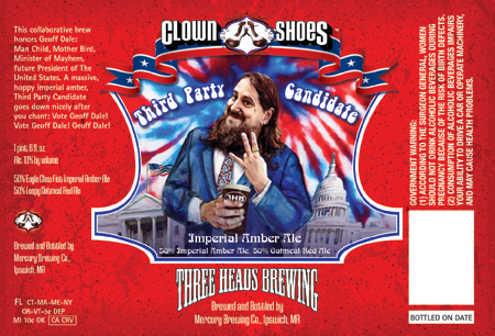
Presenting my latest label for Clown Shoes Beer, Lubrication American Black Ale. The launch party is tonight at Foundry on Elm in Davis Square, Somerville. Foundry is new to the area, I’m not sure when it opened, but it feels like it’s been in the Square for years. It is classic and comfortable, with elegant seating and lighting, and a slight edge that lets you know that the food will be approached with an artistic eye and creative twists. Also, they serve poutine! So, yeah, you know I’m giving Foundry the thumbs up.
Now, back to the label. This is only phase one of the Lubrication package design, as Lubrication will be the first Clown Shoes beer available in 12 oz. bottles. The smaller bottles will come in a 4-pack carrier and in cases.
The 12 oz. label presented a new challenge. Because all of the previous Clown Shoes beers were only released as 22 oz. bombers, the labels had a lot of real estate and that allowed me to develop a direction that was very illustration-centric. The 12 oz. bottle labels are considerably smaller, but require a lot of the same information, legally speaking. Featuring a prominent illustration would not be practical, yet, the illustrations are part of the brand we’ve established for Clown Shoes.
To further complicate matters, Clown Shoes is planning on releasing the Clementine White Ale to a 12 oz. bottle, too. The Clementine label was illustrated and designed over a year ago, when they only released 22 oz. bottles. Whatever solution I developed for Lubrication would have to be retro-fitted to work with Clementine and any other previously released Clown Shoes bombers.
The solution was to design a “shoe-centric” text only label for the 12 oz bottles that would incorporate a single identifying mark of the 22 oz. label, for the Lubrication it’s the white, horizontal “grill lines,” for the Clementine, the swirling unpeeled oranges. Then, on the 4 pack carrier, the illustrations will be expanded beyond the small windows on the 22 oz. bomber labels to fill one full panel of the box. This kept our illustration-based branding visible on the cooler shelf, but gave us a simplified, scalable solution for the 12 oz. labels and by extension, the case box design which could only be 2 colors.
I can’t wait to post photos of Phase 2, the 12 oz. bottles, the 4 pack carriers and the case boxes. We’re also getting custom crowns, bottle caps to you and me. They’re on a ship in the Atlantic at the moment, but they’ll be here in a few weeks. In the meantime, I’m going to crack open this bottle of Lubrication and pour myself a tall, dark and handsome pint of ale.
Very, very few of us spring fully-formed like Athena from the head of Zeus. And very, very few of us are graphic design prodigies. Those who are often hire people like me to do the practical and boring work of executing their brilliance. And me? I bask in the glory of learning how their minds work.
Sometimes I freelance on-site for companies. I may be helping during a busy time, or I may be covering for someone who is on leave, or maybe I’m assigned to a short term project. For instance, a few years ago, I was asked to help the “Soft Home” department of a national retailer prepare a number of bedding files for release to the factory. I’d never worked with textile files, but once I had the specs the process wasn’t much different than releasing files for print. I simply needed to stay organized, dot my i’s, cross my t’s and think of England.
I finished faster than expected and needed something to do for the rest of the day. The department manager asked if I could draw. Yes. I’m an illustrator first and foremost, and I can draw. He asked if I could draw jewelry trees. “If you show me what a jewelry tree is,” I replied. I’m not really a jewelry tree kind of gal, I guess. He spent a few minutes showing me various jewelry trees and explained that the “Hard Home” department needed to sketch a number of potential products for factories in Asia to prototype so the buyers could make decisions for next year’s line. Could I draw a handful of jewelry trees with various floral motifs?
Now, I’m not a product designer. Never said I was. And I wasn’t hired to sketch jewelry tree prototypes. But I was getting paid for the day and I’m game for something new. I ended up staying on that job for five months longer than I was initially contracted, drawing jewelry trees and frames and desk accessories and a whole bunch of fun Halloween products and learning a ton about how these products are developed and produced.
In the same way I’ve learned how to design soccer balls and goalie gloves for Brine/Warrior Sports. I learned how to manage and update an enormous CMS for a major medical manufacturer. I’ve developed labeling and packaging for an upstart craft brewery. I showed up, I listened, I used the experience I already have to ask smart questions and I turned down no challenge. I could probably extrapolate that and say it’s how I’ve raised my son, as well.
Being intelligent is not knowing all the answers. Being intelligent is being open to new experiences and knowing where to look for the answers. An intelligent designer will grow with your business and find the right solutions to create your brand and communicate your message.
The Clown Shoes Tramp Stamp illustration had to be sexy and flirty, without being trashy. The graffiti backdrop and the sassy pose suggests our model knows that you’re checking her out, and she’s just fine with that. The Clown Shoes tattoo on her back was produced as a temporary tattoo to be given out at events and tastings.
The Clown Shoes Eagle Claw Fist has one of the best sidebar stories, “At Clown Shoes we do Kung Fu, junior high playground style. One morning a move was busted and an ale was born…”
As a girl with two little brothers, I saw a lot of playground Kung Fu growing up and I knew our label protagonist had to have that Karate Kid, Enter the Dragon, Mortal Combat, kid fantasy style to him—but with Clown Shoes.
I still remember the creative brief for Brown Angel. “Sexy, hip-hop, in your face, with wings, a thong, and Clown Shoes. But make it elegant…” That, my friends, is a design challenge!
The result is your hottest girlfriend giving you a private dance, with an amazing body and a sense of humor, kind of like Clown Shoes beer!
The Clementine White Ale is my favorite Clown Shoes beer and my favorite Clown Shoes label. Clementine is a summer drink, sunny, bright, with a strong citrus infusion. The label illustration references vintage orange crate poster art and is notable as the first Clown Shoes label without a person to wear the ubiquitous shoes, not that I let that stop me.
Hoppy Feet Black IPA is Clown Shoes Beer’s flagship product. The illustration sets the tone for the brand, relaxed, silly, enjoying life, and loving good beer. The original label was designed by artist, Alan Pearsal, and wasn’t really working with the rest of the brand, so I kept that ‘put your feet up’ quality and focused your eyes where they should be, on the Clown Shoes, and the beer, and that wonderful feeling of ending a long day with a good pint.