That’s right, I’ve added a Logos category to my portfolio. There are only a few uploaded so far, but according to my agent, it’s an important skill set to showcase. Not sure how she’s going to feel about that last one, however.
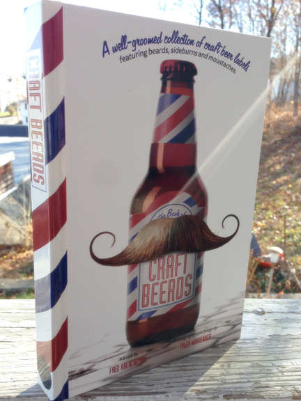
It’s been radio-silence from me since last week, and I apologize. I’ve been running about handling off-line responsibilities and there has been little time to blog. But I’ve been taking notes and taking pictures and I’m ready to report on Operation Twelve Ounce Bottles.
Clementine Case Box Flat
Case boxes, 4 pack carriers, 12 ounce bottle labels, custom crowns, every one with a different vendor, and they all need to coordinate and get to the brewery on time. I think the best way to anticipate issues and do things right the first time is to know everything you can about the process. So, I visited Unicorr Packaging Group,Imperial Packaging Corp, and Mercury Brewing to check out the whole process.
This will be die-cut and folded into the Clementine 4-pack carrier
I mentioned a few weeks ago the importance of working with your production artists, and the people at Unicorr really proved that to be true. Our case boxes were designed as a two-color job for cost efficiency and to work with our simplified 12 oz bottle label. But the blue and orange of the Clementine White Ale labeling don’t overprint on cardboard very well. I worked with the production team at Unicorr and we developed a half-tone solution that solved the problem and could be extrapolated to the Lubrication case box and any future Clown Shoes cases.
Imperial Packaging is located in Rhode Island. There are larger companies who specialize in beverage carriers, but Imperial is a local business that’s growing. They just moved into a larger facility in Pawtucket and I was one of the first clients to visit. I was given a tour of the facility, approved my Clementine carrier make-ready right off the press and got a great recommendation for an Italian restaurant that serves stuffed calamari.
Finally, I visited Mercury, who contract brew Clown Shoes Beer. Now, I didn’t really NEED to visit the brewery, but I find it helpful to understand how the bottling and labeling process happens—plus, I got some beer samples and went out for steamers with my son for dinner afterwards. We were in Ipswich, after all. I think it’s the law that you have to eat some seafood before you leave the town limits.
Lubrication 4-Pack of 12oz Bottles
So, Lubrication 4 packs are on their way to liquor stores near you and Clementine 4 packs are bottling this week. Then, on to bigger and better Clown Shoes beer labels, with an emphasis on “Bigger.” Stay tuned!
Located in Uphams Corner, Dorchester, the Salvation Army Ray and Joan Kroc Corps Community Center is a cutting edge service, education and health center. I was honored to design the invitation and program materials for the Dedication Ceremony this Spring. The theme of the event was The Promise of Hope—Fulfilled, I designed the invitation, shown here, with a short cut first panel, revealing the sky of the panel beneath and opening to reveal the artist’s rendering of the new center, the fulfillment of a promise from Ray and Joan Kroc to the Boston community. (the image illustrates the tri-fold invitation as you open it. Left to right, cover, first two panels, full spread)
Last night, my friend, Cathie, invited me and my son to join her and her daughter for the Sox vs. Jays game at Fenway. We had amazing seats, first base line, 7th row, you could almost touch the players, it was too much fun.
About halfway through the 4th inning my phone started buzzing with Facebook posts and text messages all related to this article on Boston.com. The post was referring to a kerfluffle on Beer Advocate in which a contributor to the site launched a full out rant aimed at my client, Clown Shoes Beer, and their sexist, racist labels. The diatribe resulted in a 350 comment thread in which people both agreed with the original post or defended Clown Shoes’ right to be, well, clownshoes. It also included a comment in which the original poster quoted me out of context and made it seem like I agree with her. The thread was locked before I got home from the game, leaving me with no opportunity to defend myself.
So, this is my response to the question, “Are Clown Shoes’ labels offensive?” Sure. Why not? Offensive is a subjective term. If you look at the labels and find yourself offended, there you go. Do you have the right to say so? Abso-friggin-lutely! Shout it from the highest mountain, or your Twitter account, or your brothers’ website, whatever your bullhorn is, use it, loud and proud. Here, let me loan you a sandwich board and a bell, you can be offended Town-Crier style, I got your back.
I get it. There are things that offend me. For instance, due to an unfortunate misunderstanding of lyrics, I cannot listen to Sublime’s Wrong Way without getting offended. Politicians who proudly misunderstand the basic facts of American History offend me—mostly because they’re too lazy or stubborn to find out the right answers and correct themselves. Those ASPCA commercials with Sarah McLaughlin offend me because they always run them in the middle of South Park, or Tosh.O and then I feel guilty for laughing when we come back from commercial. So, if someone looks at the illustrations I’ve done for Clown Shoes and finds them somewhat distasteful, then you go on with your bad self and be put out. It’s your right.
However…
My labels for Clown Shoes—which were named Best Craft Beer Art of 2011 by PourCurator.com—are not illustrated with a sexist intent. For instance, a Tramp Stamp is a tattoo placed on the lower back of a woman to emphasize her sexuality. In Germany, they call it, Arschgeweih, meaning, “Ass Antlers.” Can you imagine if we had named a beer Ass Antlers!? We have nicknames for these tattoos because they have a purpose. The woman who has one is confident in her sexuality and she is enticing the viewer to appreciate her. A woman who is comfortable in her own skin and likes how she looks is a sexy woman. Sexy is not sexist. In fact, sexist is rarely sexy.
Brown Angel is a mix between pin-up girl, Blaxploitation goddess, and hip-hop diva. She was inspired by Pam Grier in Coffy, and Rosie Perez dancing to Fight The Power in the opening of Do The Right Thing. These are powerful women, not victims, and just because they have ethnicity, doesn’t mean the label is racist any more than appreciating a Bettie Page pin-up makes one a white supremacist. As a woman, and an artist, I have a hard time with either of these images being labeled chauvinistic. Chauvinism is an attitude of superiority over the opposite sex. I’m not designing woman who are inferior, I’m designing women who celebrate who they are. So, who is bringing the inferiority? The viewer? The offended? It’s a complicated question.
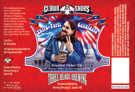
Finally, and this one made me guffaw, I mean seriously spit take—Clown Shoes Lubrication. Why is Lubrication offensive? Well, first, we’ve got the name. It’s tongue-in-cheek, it’s having some fun, but the label copy pulls it all together, “Lube? Hey, get your mind out of the gutter. Social lubrication, people coming together to unwind, is what we’re talking about.” This is not a dirty joke for the sake of being dirty. Lubrication is an American Black Ale, dark as oil, but at only 6% ABV it’s one of Clown Shoes’ first sessionable beers. The social lubrication marketing gives you an idea what you’re getting in the bottle.
Clown Shoes Lubrication, Full Illustration
Second, the illustration is apparently offensive because of the placement of the gas nozzle. Next time you fill your tank, take note of how high you hold the nozzle, I’m guessing it’s not up by your belly button unless you drive a Hummer. Apparently, our critics saw not a dispenser of fuel, but a “dong.” Yes, their words, not mine. I went to art school. I was taught to say, “phallic symbol.”
Now, let me tell you, when I designed this I was inspired by Ed Ruscha’s gas station paintings, 1950’s sci-fi robots, and by those old Texaco commercials with the jaunty hats and ties. That’s it. You get your car lubed at the service station and a tin-man requires lubrication, it works both ways. The client actually wanted to go sans-illustration for this beer, but I convinced him that it would be inconsistent with the brand and that I had a great idea! Never in my wildest imagination did I think this label would inspire such vitriol! But when you have dong on the brain, you see dong wherever you go, I guess. Ironically, robots don’t even have sex that way, there’s a lot more welding and screaming of 0s and 1s.*
So, there you go. If you find your way to my website because I illustrated some beer labels that started a tiny tempest, you will see that I put a lot of thought and research into offending people and selling beer. I also design yearbooks for elementary schools and websites for stores your mom would probably like. I appreciate this opportunity to respond to my critics and I encourage you all to drink good beer with a sense of humor and an open mind.
Remember that the salesman’s job is to get you in the door, but it’s the production artists and the pressmen who are going to get you out on time.
Ask for the moon and until that purchase order is in his hands, the printer’s salesperson is going to tell you that everything is do-able, everything is copacetic. It’s not until the job is in house and it’s too late to change your mind will you discover that your turnaround requirements are ridiculous, or your file needs some serious tweaking and trapping, or your ink densities are proof of dark matter. At that point, the production artist and press person are your best friends in the world. If you treat them right, remember their names, respect their craft and their time, they can move mountains for you. Bark at them, ask for the impossible, fail to understand what can and cannot be accomplished on a press, talk past them to your sales guy, and, well, do you ever wonder what happens when you send food back to the kitchen at a restaurant? No good ever comes of that, I assure you.
Building relationships with the people who run your jobs can be the difference between really delivering for your client or really blowing it. So, play nice, prima donna designer, you’ll thank me some day.
First and foremost, forever and ever, get it tattooed on your forearm;
If there’s a holiday ANYTIME near when you want your job printed, add a week to your turnaround.
Printers work crazy hours, printers work all night, printers don’t leave until the job is done, no seriously, doctors can hand off their patients, but I’ve seen pressmen 3 days into a run and I know they’ve only napped in the break room. So, when Memorial Day, July 4th, Labor Day, Columbus Day, Arbor Day… are you following me yet? Any holiday, no matter how big or small, is a day of rest for these fellas and they aren’t giving it up with out time and a half and then some.
So, your brochure HAS to be ready to go July 7th? You need to have that sucker on a press by the third week of June, at the LATEST. I’m not kidding.
Thank you, this has been a Public Service Announcement from your Friendly Neighborhood Designer.
Tools Tuesday, something tells me this could be an awkward category to carry forward!
One of the things I would like to do with this blog is showcase tools that help me do my job better. This could be a book, a website, an app, an inspiring place to take a walk, etc. Today we have an app.
I’m a Mac girl, naturally a lot of us “creatives” are. But I have used PCs, I have heard great things about Android phones, I don’t judge people by their laptops—by their music collection, yes, but not by their laptops. That said, most of the software I’ll be recommending will be for Apple products.
It took a while for me to find a time tracking option that worked for me. I wanted to avoid a subscription based model like Cube or one that would hit me with lots of expensive in-app upgrades like TimeMaster + Billing. If possible, I hoped to find an app that was affordable, universal for iPad and iPhone, and allowed me to export and backup my information. But most importantly I didn’t want to change how I do things to match the app, I wanted an app that was customizable enough to work with me.
TimeTracker by Silverware Software is pretty new to the App Store. It’s available for iPad and iPhone. It’s $2.99 with two in-app upgrades available, Device Syncing for $1.99 and Dropbox mobile backup for another $0.99. The interface is very clean and simple with a little customization available, for instance you can upload client logos or other icons to the time logs. It allows for a variety of billing options, including Flat-Rates, Pro-Bono and Day Rate and it even tracks your break time, if you like to record that kind of thing. Information is exportable in plain text or CSV for easy porting to Excel or Numbers.
I particularly like that it can remember frequently used clients, projects, rates and tasks which makes it less labor intensive to record all the important information that you might forget later, like, “what, exactly, was I researching for my client for 3.5 hours last Wednesday night? Hmmm, now that he’s questioning the invoice, I can’t recall!” You don’t want to be in that situation, neither does your client, so making the annotation of your time as automatic as possible is a definite plus for everyone.
I can’t speak to how TimeTracker would work for me if I had a number of employees. I really wasn’t looking into a solution that would apply to an office. But for a single freelancer who wants to get paid for the time she’s working, and track where that time goes. I think it’s an excellent, easy-to-learn, and affordable tool.
TimeTracker for iPhone, Time LogTimeTracker for iPad, entering hours and information
Working for a tech start-up in August 2008 was like having tickets for the maiden cruise of the Titanic. Everyone was working hard, making money, enjoying Free Bagel Fridays and signing up for ping-pong tournaments. And then we hit an iceberg called Lehman Bros. and it was women and children first.
Before disaster hit, I was focused on developing the company branding and producing collateral materials like this presentation folder and datasheets. Free bagels, sigh, it was fun while it lasted.
Dreamday at Stonehedge Farm was an event to thank major donors to Beth Israel Deaconess Medical Center. kor group of Boston created the branding and marketing for Dreamday at Stonehedge Farm featuring original acrylic paintings by local artist, Ann Marie O’Dowd (see cover illustration.)
As production design manager at kor group, I was charged with managing production and installation of all of the event signage and providing production support to the design team, including creating this fun and colorful illustrated map for the event program.