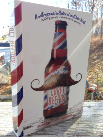
That’s right, I’ve added a Logos category to my portfolio. There are only a few uploaded so far, but according to my agent, it’s an important skill set to showcase. Not sure how she’s going to feel about that last one, however.
Presenting my latest label for Clown Shoes Beer, Lubrication American Black Ale. The launch party is tonight at Foundry on Elm in Davis Square, Somerville. Foundry is new to the area, I’m not sure when it opened, but it feels like it’s been in the Square for years. It is classic and comfortable, with elegant seating and lighting, and a slight edge that lets you know that the food will be approached with an artistic eye and creative twists. Also, they serve poutine! So, yeah, you know I’m giving Foundry the thumbs up.
Now, back to the label. This is only phase one of the Lubrication package design, as Lubrication will be the first Clown Shoes beer available in 12 oz. bottles. The smaller bottles will come in a 4-pack carrier and in cases.
The 12 oz. label presented a new challenge. Because all of the previous Clown Shoes beers were only released as 22 oz. bombers, the labels had a lot of real estate and that allowed me to develop a direction that was very illustration-centric. The 12 oz. bottle labels are considerably smaller, but require a lot of the same information, legally speaking. Featuring a prominent illustration would not be practical, yet, the illustrations are part of the brand we’ve established for Clown Shoes.
To further complicate matters, Clown Shoes is planning on releasing the Clementine White Ale to a 12 oz. bottle, too. The Clementine label was illustrated and designed over a year ago, when they only released 22 oz. bottles. Whatever solution I developed for Lubrication would have to be retro-fitted to work with Clementine and any other previously released Clown Shoes bombers.
The solution was to design a “shoe-centric” text only label for the 12 oz bottles that would incorporate a single identifying mark of the 22 oz. label, for the Lubrication it’s the white, horizontal “grill lines,” for the Clementine, the swirling unpeeled oranges. Then, on the 4 pack carrier, the illustrations will be expanded beyond the small windows on the 22 oz. bomber labels to fill one full panel of the box. This kept our illustration-based branding visible on the cooler shelf, but gave us a simplified, scalable solution for the 12 oz. labels and by extension, the case box design which could only be 2 colors.
I can’t wait to post photos of Phase 2, the 12 oz. bottles, the 4 pack carriers and the case boxes. We’re also getting custom crowns, bottle caps to you and me. They’re on a ship in the Atlantic at the moment, but they’ll be here in a few weeks. In the meantime, I’m going to crack open this bottle of Lubrication and pour myself a tall, dark and handsome pint of ale.
When Brine/Warrior Sports asked if I’d like to try my hand at designing goalkeeper gloves, I replied, “Goalies wear gloves?”
I think I’m one of 13 people in America who didn’t play soccer in their childhood. Not once. I didn’t know anything about the game beyond you can’t use your hands and L.A. got Beckham past his prime. But I was performing some light packaging production work for Brine and it was the holidays, so the office was slow and my manager thought it would be a good time to get a head start on some product development.
The stitching across the backhand of the gloves is the Brine “King” logo turned at an angle and the striping on the wristband is derivative of the curls of his hair. The design became the Brine King Goalkeeper Glove line, available in 3 levels of protection.
Sunday, my son and I stopped into our local grocery store to pick up some rolls for the Hawaiian Pulled-Pork sandwiches I was bringing to my nephew’s high school graduation party. As we walked in, we ran into a guy in his twenties with a bushy beard, wearing skinny jeans, Chucks and a black vest over his retro concert tee. His wife was right behind him, tight pixie cut with a streak of pink, flowing sundress and Doc Martens. Their eyes were down, their faces grim. Last came their little daughter, skipping in her pink rain boots, loving life. We passed them and my son said quietly, “We were gonna be hipsters for-EVER and then SHE came along!”
It’s tough to be the grown-up, especially when you still feel like the new kid in school. I spent the weekend at high school graduation parties and faced my own mortality with the grim look of those grocery shopping hipsters. Then a friend of mine posted to her Facebook asking advice for choosing the right high school for her daughter who wants to work in “multi-media design and art.” Should she chose a vocational and career school? A private college prep school? Or just her local public high school?
I have no qualms with vocational schools, my son attends one. But when I toured his school I remember the graphic design teacher asserting that, “your kids don’t even have to be ‘good drawers,’ because the software does that for you now.” I came home and told him he could go to the school, but only if he didn’t want to be in the graphics program!
This industry is full of people who can use Photoshop, but if they can’t think, if they can’t draw, if they can’t solve communications problems with creative solutions, then what service are they providing exactly? Give me the graphic designer who is well-read and well-rounded and I can teach them how to use the latest technology.
And that’s what I left as my comment to my friend’s inquiry. I suppose one of the benefits of being the grown-up with experience is passing it on to the next generation. That said, I still wear my Chucks pretty much everyday because I’m gonna be a hipster for-EVER.
One of the cool things about having a graphic designer for a parent is you get a pretty spectacular yearbook for your graduation from elementary school. I designed the book, illustrated the cover and photographed all the students and faculty. But more importantly, I suggested a digital printing solution that allowed the books to be produced under budget. The quality of the books were such that the parents were able to sell many times more sponsor ads than in any year previous and the additional income negated the need for the children to hold a car wash to pay for their class graduation party.
The Bradford Mercantile is a brick and mortar store in Rhode Island, well actually it’s in a historic yellow barn. It is a uniquely New England shop specializing in wares for the colonial and primitive homes. I worked with the development team to design the visual elements of the site to compliment the style of the shop.
The Cambridge School of Weston is a progressive, coeducational school with an active and engaged alumni. This invitation for all alumni to attend their annual spring reunion took their existing modern and colorful branding and added the suggestion of celebration and fun.
The invitation needed to include the itinerary as well as reservation and accommodation information, so a tri-fold self-mailer was a successful solution. (the image illustrates the invitation as you open it. Left to right, cover, first two panels, full spread)
I have needed to build a portfolio site forever. I had one associated with my personal blog years ago, but then my son hit puberty and I was forced to take down my site full of great, albeit embarrassing stories of his youth. With it came my portfolio site and I’ve neglected replacing it ever since.
The problem is a common one for designers, we want everything to be perfect. To be a good graphic designer that’s a job requirement. We need to identify every flaw and fix it until there is nothing left to fix—then look in the mirror and remove one accessory before leaving the house, right? But when perfection becomes the bottleneck that keeps you from moving forward, it no longer serves its purpose.
So, I bit the bullet and started with a wordpress template. It hurt. I felt like the master seamstress buying her daughter’s wedding gown at David’s. It’s cheating, right? But I’m tweaking the template, I’m identifying flaws, I’m making it work for me—the client—and I’m getting my portfolio online where people can see what I do and maybe pay me money to do it for them.
And that’s the purpose of communication—not to show off how clever your designer is, not to recreate the wheel—to get your message out there and build your business.
So, this is my site. It’s not perfect, but neither am I. But it’s good and that’s something we have in common.